25 Aug ON MAIN: Edgy Art Space Hosts Matt Kleberg
It’s all about altitude with attitude.
Two long-time Telluride locals and internationally renowned tastemakers, Ellen Geldbaugh and Catherine Walsh, conceived of ON MAIN as a collaborative space dedicated to fine art and the art of living well. The goal of their venue is to push the cultural envelope in town by bringing progressive art experiences to the Telluride region and beyond.
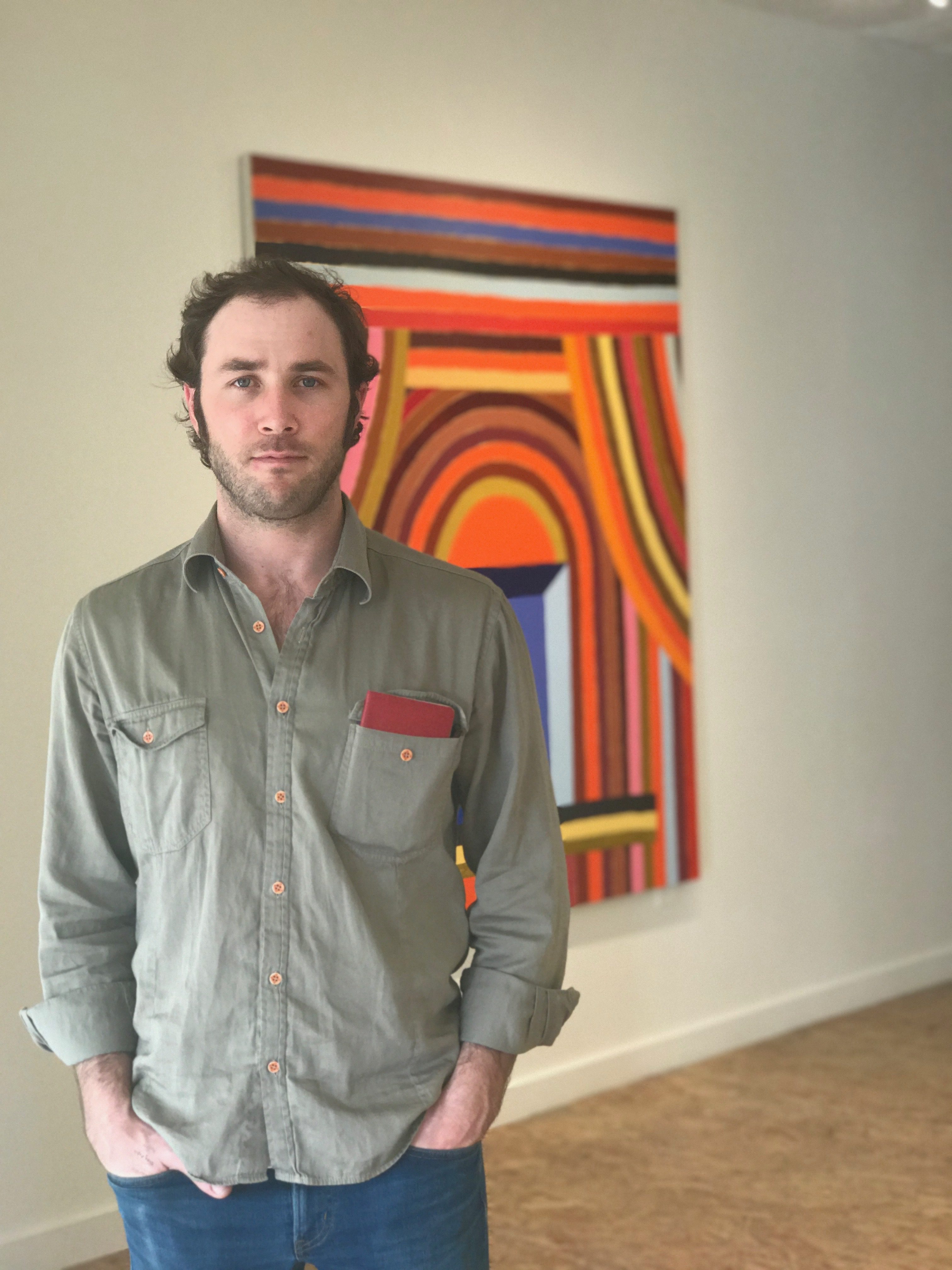
For its second show, “FRAMEWORK,” ON MAIN features the work of Brooklyn-based Matt Kleberg, who also has deep ties to Telluride. Hours during the Telluride Film Festival weekend are extended from 11 a.m. until 8 p.m., then 11 a.m.- 6 p.m., Tuesday – Sunday, throughout the fall season.
Matt Kleberg will be at the gallery to talk about his paintings and drawings all day Wednesday, August 29.
“A work of art is a corner of the creation seen through a temperament,” Emile Zola.


Matt Kleberg
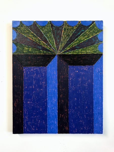
Through the centuries, the depiction of doors and windows in art has resonated with subtext. Portals of all stripes (in this case, literal) variously symbolize a boundary, an escape, a way to new opportunities – or the closing off of potential, a dark menace lurking on the other side. However, sometimes doors and windows really are just doors and windows, beautiful in their patterns, structure and solidity.
Matt Kleberg paintings of abstracted passages in the form of warped prosceniums and archways are largely built with oil sticks which lay down brightly-hued stripes and concentric shapes of ofttimes cacophonous colors. Structurally the artist’s intensely engaging, decorative images walk a tightrope between architectural volume and painterly flatness, paying tribute to one of the artist’s major influences: Frank Stella. However, while honoring his debt to one of the greatest artists of the 20th century and beyond, Kleberg takes exception to one of Stella’s most famous dictums: ‘What you see is what you see.” In contrast, he believes:“We can’t escape the world. It is our visual vocabulary.”
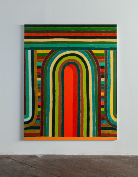


In other words, what we see on the surface of Kleberg’s paintings is not all that is there.
The stage-like spaces are open invitations for the viewer to step inside the central space and take part in the implied action. That’s because making art for Kleberg is not simply about the right color on the right surface, it is a synthesis of his experiences, which range from, but are by no means limited to his cowboy roots, Brooklyn architecture and signage, Byzantine and Sienese paintings, Mexican and Turkish tiles, Stella and Dr. Seuss.
The Big Idea behind that pile up of the disparate influences that inform his canvases seems to be the artist’s determination to underscore life’s innate ambiguities, its essential question marks and tensions, while wholly metabolizing the adventures of daily life along the way.

However, carpe diem: we enter Kleberg’s “theater” with caution. The architecture of his paintings is cleverly constructed to first open up then close the space, pushing us back out into our world, the world of the observer, not the observed. That intrinsic dynamic underscores the boundaries between art and life, between the sacred space of Kleberg’s niches and our day-to-day lives, while celebrating both.
“I don’t think about painting as a way to escape the world. Rather, good painting roots us more firmly in the world with all of its matter and mystery,” explains Kleberg, who elaborates further on that point below.
We e-talked about history and art. The results of that online conversation about his life and work follow. Bottom line: Matt Kleberg seems to have as many centers of attention and interest – which continue to evolve at the wonder of everyday – as he has strokes of his oil sticks and black pens.

Q: You were born in Kingsville Texas, in the wide open spaces of red dirt country, a descendent of five generations of cowboys. But you are not a cowboy. Neither are your parents. You are a painter. Talk about the left turn you and your parents took from the family history and why. Also did you choose making art as a career or did art choose you?
MK: You are right, I am not a cowboy, although my dad was one and I worked on the ranch as a teenager. Around the age I am now, my dad shifted his vocation from ranching to business, moving from something he was very proud of, but hadn’t built himself, to a new arena where he could create something new. I think my decision to follow art was rooted in a very similar impulse. That said, it wasn’t without hesitation. I intentionally avoided art school and tried to study anything but art in school, something more conventionally practical. Didn’t work. I ended up with degrees in theology and studio art despite myself. In that way I do think art chose me.
Q: Your work used to contain images of people and things. Now your architectural paintings and drawings are devoid of anything but the abstracted portals that fill them. Why did you drop the people and things? And why the focus on structures and their portals? And how does Brooklyn, now in a renaissance, figure into, well, the Big Picture?
MK: My work is never “strategic.” Major changes from one body to the next have been just as surprising to me as to anyone else paying attention. The evolution looks inevitable in hindsight, but in the moment I just try to let one painting lead to the next. The figurative work I was making up until a few years ago often featured a central, frontal, iconographic subject – there were cowboys, birds, bottles, skulls – but eventually those subjects began to feel interchangeable. There was a painting of a bottle in my studio and the bottle felt plugged in, nonessential, so I painted it out. What was left was the space previously occupied by the bottle. That central, vacant, but anticipatory space became the subject of subsequent paintings, and the architectonics became a way of framing or setting up that stage. I don’t really think of them as abstract paintings, more like figurative paintings with the figures plucked out.
On some level, I’m sure our move to New York had something to do with the shift. It’s true that my surrounding environment became a predominantly architectural one. I think architecture and painting have a lot on common. Buildings and canvases are structures that frame and contain potential actors and actions.
Q: Your work is often described by cognescenti as a tip of the hat to Frank Stella. But Stella was about the idea of painting limited to its essential means: What you see is what you see. By that he meant a work on canvas or on whatever is exempt from references other than to itself. Stella did what he did as an answer to what he saw as a crisis in abstract art. The Ab Ex boys, the gods of the art world in the generation that preceded Stella’s, were not really doing abstract: We cannot think of Mark Rothko or Clyfford Still, Motherwell, as just three of many examples, without conjuring a landscape, spiritual or otherwise.
You also indicated in previous interviews that Caravaggio was an early influence, along with Ellsworth Kelly, Velasquez, Manet, Anselm Kiefer and Agnes Martin.
So do you see yourself aligned with Stella and those other artists? I mean as far as Stella goes, your work is not polemical and it is not flat. Or baroque as his later work was. And do you see your paintings and drawings as falling into any classical art “ism” at all? Or does your work synopsize several “isms”?
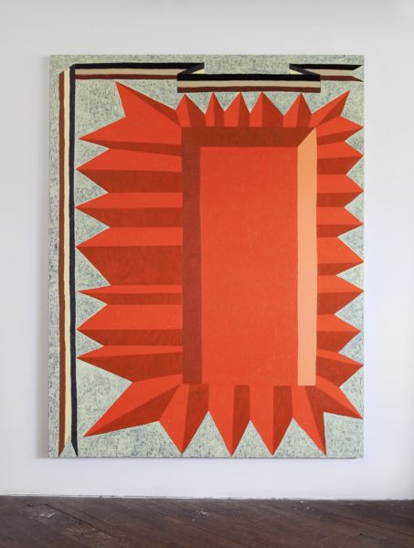
MK: First of all, I owe a great debt to Stella; he is a monumental artist. But I think he is slightly disingenuous when he said “what you see is what you see.” I don’t believe any abstract artist creates work truly devoid of reference or external content. Stella’s “Black Paintings” have everything to do with architecture, Islamic ornament, and so on. Josef Albers’ “Homage to the Square” paintings came out of his many trips to Mexico and its pre-Columbian ruins. As you mentioned, same goes for the AbEx dudes. Same goes for Agnes Martin; same goes for Malevich and any other great painter we are likely to name. We can’t escape the world. It is our visual vocabulary.
Stella’s early paintings are at once completely flat AND wildly spatial. They radiate into deep space and they project forward, invading the space of the viewer. The newer work does that in a literal way, coming out off the wall. I try to make paintings that complicate their own space: they have the illusion of depth, but they snap back flat. The architectural elements in the work speak directly to the architectural environment in which a painting is situated. I don’t think about painting as a way to escape the world. Rather, good painting roots us more firmly in the world with all of its matter and mystery.
We live in a world of infinite competing narratives, so it’s hard for there to be any clear “isms” anymore. That said, the American Modernism of Marsden Hartley, Charles Burchfield, and Stuart Davis appeals to me – that sense of mystery and electric charge embedded in nature – only without the Utopianism that came with it. So maybe my thing is modernism tempered by an appropriate dose of doubt.

Q: In Walter Isaacson’s book about DaVinci, which you have stated you listen to in your studio, he says that Leonardo’s genius was based on skills we can improve upon in ourselves: passionate curiosity, careful observation, and an imagination so playful that it flirted with fantasy. Do you see that as true of all great artists? Of yourself?
MK: This one’s tough because I don’t think of myself as an artist of great imagination. I hardly invent anything in my paintings. They are mostly amalgamations of elements I encounter in the real world – but the first two are there for sure: curiosity and observation. I have a lot of interests outside of art and they definitely feed the work in direct and indirect ways.
Q: In addition to obvious, superficial comparisons to Stella, art historians have also compared your images to Byzantine mosaics and Chinese landscapes. Yet you have stated that your current body of work it is about architecture and signage around Brooklyn, about Mexican and Turkish textiles, about Byzantine and Sienese paintings – and Dr. Seuss. Dr. Seuss? Really? And actually you summed it up once by saying you are largely interested in creating work that is all about the “oxymoronic tension between static and active, full and empty.” Please connect those dots.

MK: That tension is really important to me and something required of a successful painting. In my work, I try to hold opposites together. The spaces in a painting may seem vacant, yet full of possibility; empty and exuberant; deep one moment and flat the next; inviting you in and then pushing you out.
As for architecture, Brooklyn, textiles, Byzantine painting and Seuss, those are what I see and what I like and what I look at everyday, and so they can’t help but sneak into the work. The paintings aren’t so much ABOUT them as much as a stew made up of all those ingredients. I have a one-year-old son and we read a lot of Dr. Seuss. The blues and yellows from the book “And to Think That I Saw It on Mulberry Street” inspired the palette of a recent painting whose composition was made from architecture out of Byzantine icons and striped like a Persian rug.
One common factor all of those influences share is ornament. The decorative elements are baked into the thing itself, not just surface treatment. In the paintings, the stripes are decorative but they are also the building blocks used to “construct” the space.
Q: And how do your drawings fit in to the overall picture of your pictures? You’ve stated you draw all the time. Are these drawings foundational to your larger canvases? Can the latter exist without the former?


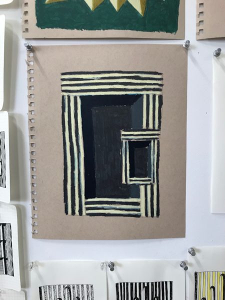

MK: I do draw all the time. I keep a small pad in my pocket and several larger ones in my backpack. I just switched the type of pen I use because the old ones kept exploding in my pockets on airplanes. If I see something interesting, some beautiful boarded up building for example, it may show up in a drawing. I may repeat that drawing 20 or more times with slight variations until it clicks and feels “right.” Often that last drawing becomes a study for the larger paintings, although I keep all of the versions pinned to the studio wall so I can refer to them. I rarely drew prior to this body of work, so I can paint without making studies but, for the last five years, the drawings have led to the paintings.
Q: Your primary medium today is oil sticks and no longer a combo of the sticks and oils? Why the switch? Please explain what the medium buys you.
MK: The sticks feel closer to drawing than a brush, more direct. And because I essentially paint with them unmixed or diluted, the color is super saturated and intense.
Q: What is your connection to Telluride and to ON MAIN? How did this show, “Framwork,” come about?
MK: I have been coming to Telluride with my family every year since 1994, winter and summer. Most of my time here has been and is spent fishing, climbing, hiking and biking. A couple years ago I got to teach a class at Ah Haa and give a lecture at the Telluride Library. That was the first time Telluride and art mixed for me, apart from making lots of drawings of Main Street facades. (Colorado Street, I know well.)
Lisa Hogan, a friend and a great patron of the arts and a person who has done amazing work on behalf of Ah Haa, invited my wife and me over for burgers earlier this summer. At her house, we ran into Bridgitt Evans, another great patron, who introduced me to Ellen Geldbaugh and Catherine Walsh, the dynamic duo behind ON MAIN. That’s how the idea for a Telluride pop-up came to be.
“FRAMEWORK” features a large-scale installation of drawings along with several over-sized paintings by Matt Kleberg.
More about Matt Kleberg:
Matt Kleberg (b.1985, Kingsville TX) received his BA from the University of Virginia in 2008 and his MFA from the Pratt Institute in 2015. Recent exhibitions include Mulherin New York (NY); Schema Projects (NY); Morgan Lehman Gallery (NY); Johansson Projects (CA); Barry Whistler Gallery (TX); Hiram Butler Gallery (TX); and the Old Jail Art Center (TX).
His work has been reviewed in the New York Times, The Brooklyn Rail, Maake Magazine, Painting is Dead, Artsy, Vice, ArtDaily, New American Paintings, Blouin Artinfo, ArtMaze Magazine, and Artillery Magazine.
Kleberg’s paintings are included in public and private collections, among them, Williams College Museum of Art, the University of California Santa Barbara Museum of Art, the Museum of Fine Arts Houston, and the National Gallery of Art.
Kleberg lives with his young family and works in his studio at the Naval Yard in Brooklyn, NY.
More about ON MAIN, Geldbaugh & Walsh:
One year ago Catherine Walsh and Ellen Geldbaugh set out to bring a progressive art experience to town and to a wider audience by featuring the work of Jarrod Beck. The exhibit, entitled STRUCTURES, was a widely attended, successful show that pushed the art aesthetic in Telluride. (More on Jarrod Beck here.)
Geldbaugh who has worked in both interior design and architecture has had a presence in Telluride for 25+ years.
Walsh is on the board of trustees of the Chinati Foundation in Marfa, Texas, and the VIA Art Fund, as well as an international beauty/fashion consultant.
“Our intention is continue to push the cultural envelope in Telluride by featuring progressive and unique art. We’re thrilled that Matt Kleberg is bringing this impressive body of work to town,” said Walsh.


Sorry, the comment form is closed at this time.